spHelper Plotting Examples
(spHelper v0.1.191)
Vilmantas Gegzna
2020-03-17
v1_spHelper_Plotting.RmdLoad packages
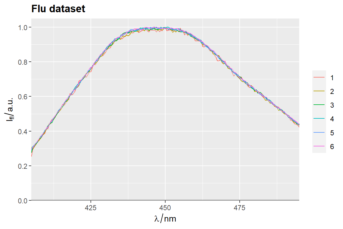
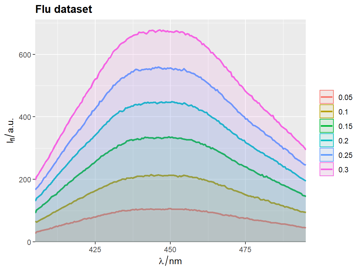
qplot_sp, qplot_kSp, and qplot_kSpFacets

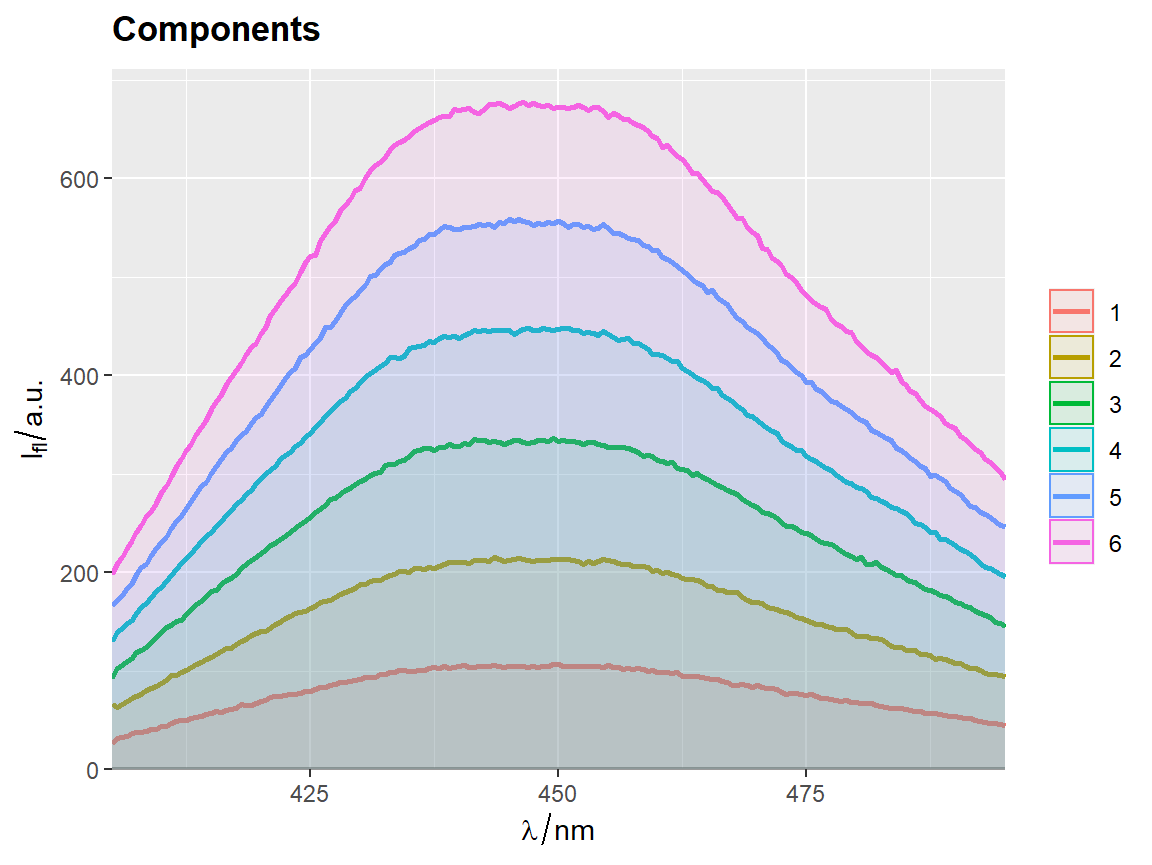
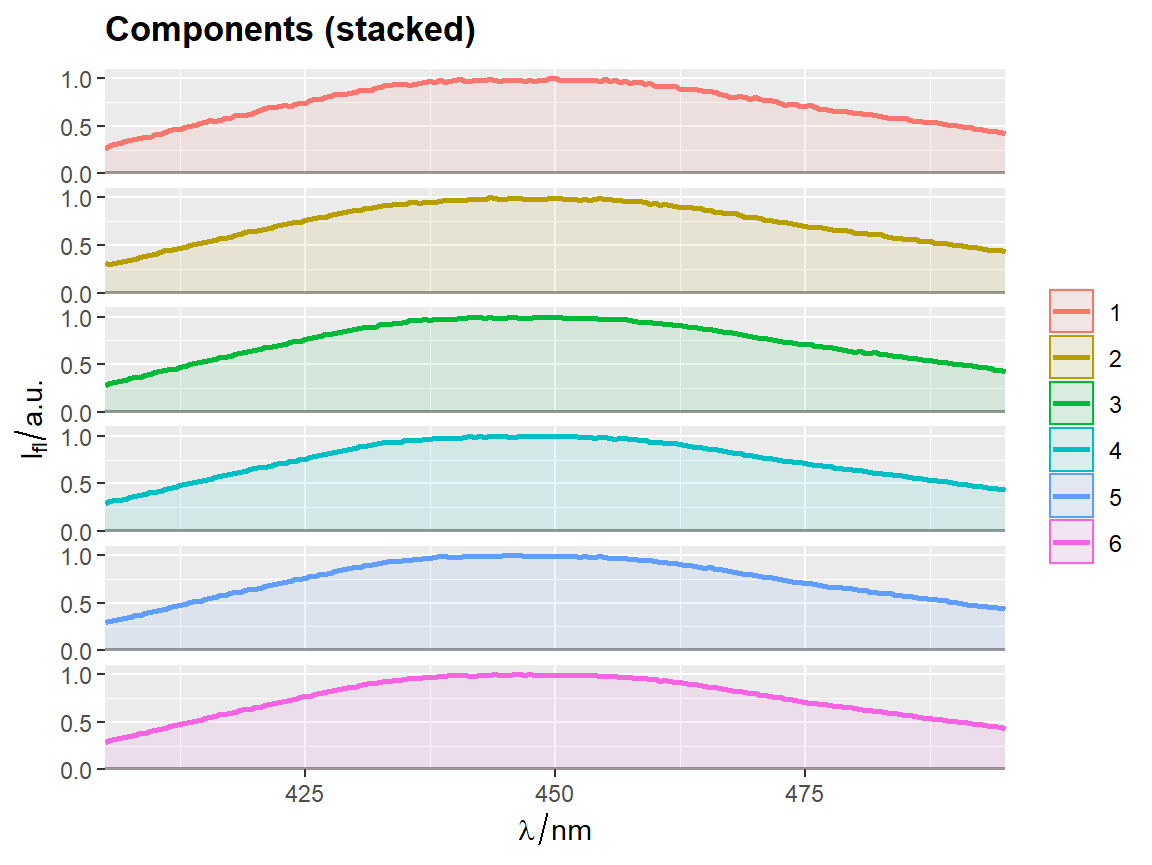
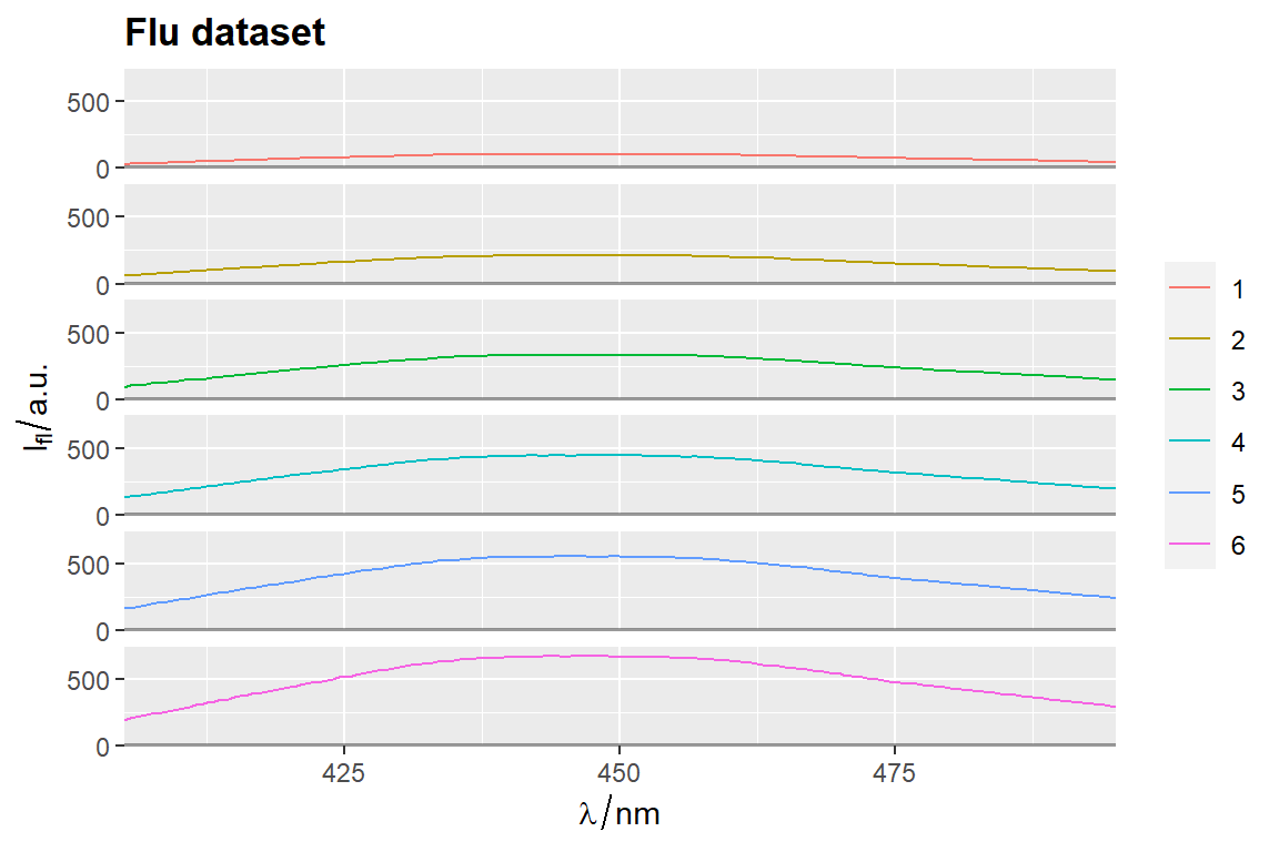
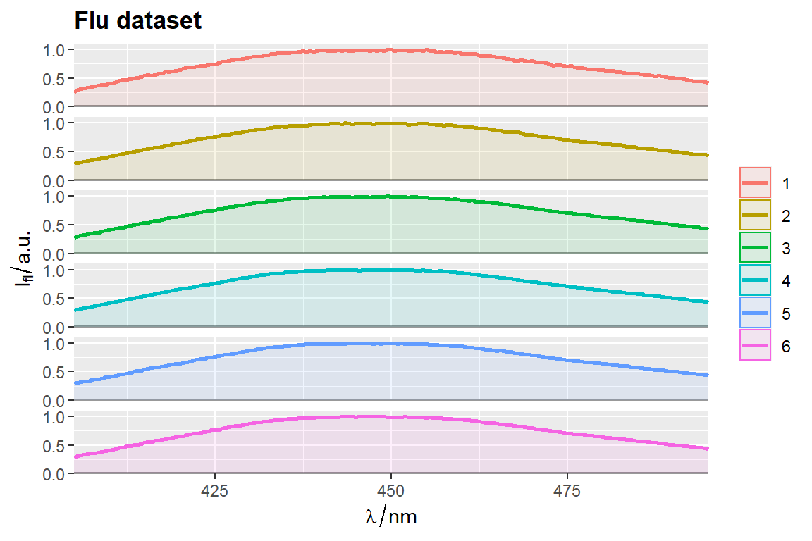

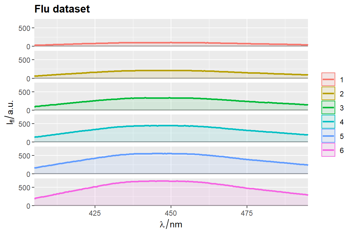

Remove fill
flu$c2 <- as.factor(flu$c)

# `qplot_sp` uses no fill by default
p <- qplot_sp(flu, Title = "Flu dataset", names.in = 'c2')

# Otherwise set parameter `filled = FALSE`
p <- qplot_kSp(flu, Title = "Flu dataset", names.in = 'c2', filled = FALSE)
p


Function center_subtracted_centers
Function calculates centers (i.e., means, medians) for each indicated group. Then common center (e.g., a center of all data, a balanced center of all data, a center of certain group or a known spectrum) is subtracted from group centers.
In this context, a is a mean, a median or similar statistic, calculated at each wavelangth.
# === Common center of all spectra as the subtracted center ================
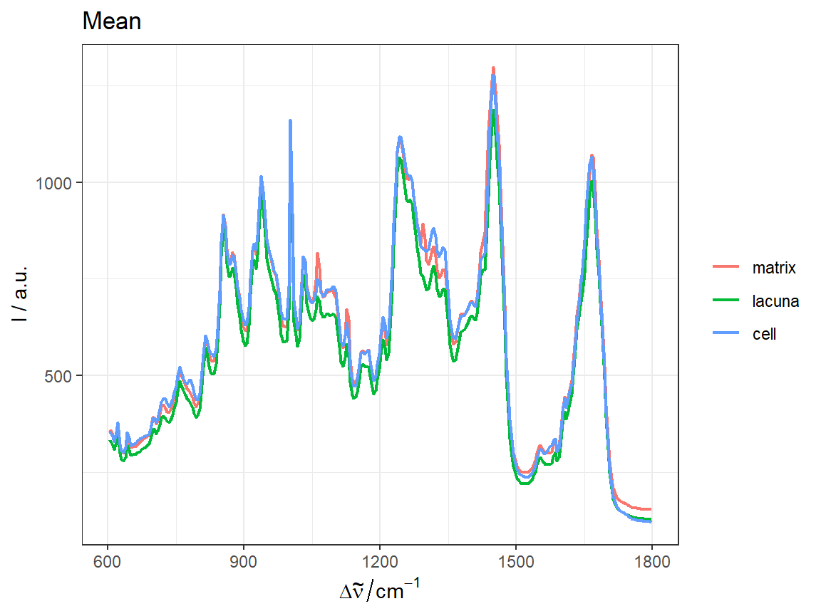
CSCs <- center_subtracted_centers(sp = Spectra2, by = "gr")
# ggplot2 type plot --------------------------------------------------------
qplot_sp(CSCs, by = "gr") + ggtitle("CSCs - center subtracted centers")
# R base type plot ---------------------------------------------------------
names <- CSCs$gr
plotspc(CSCs, col = names)
legend("topright", lty = 1, col = names, legend = names, bty = "n")
title("CSCs - center subtracted centers")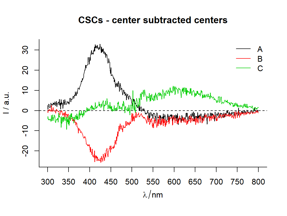
# === Center of a certain group as the subtracted center ===================

center_subtracted_centers(Spectra2, "gr", Center = "A")  %>%
    qplot_sp(by = "gr") +
    ggtitle("Subtraced center is center of group 'A'")
center_subtracted_centers(Spectra2, "gr", Center = "C")  %>%
    qplot_sp(names.in = "gr")+
    ggtitle("Subtraced center is center of group 'C'")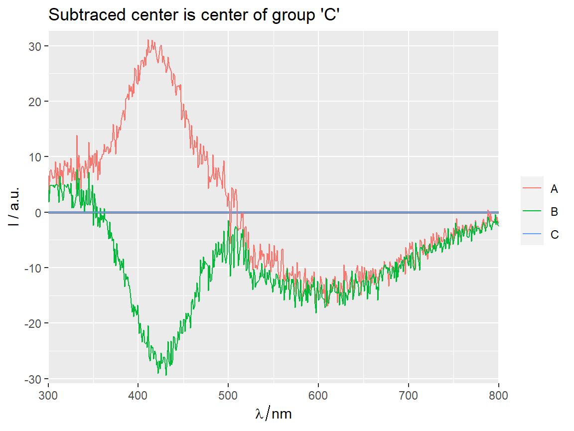
# === Balanced center as the subtracted center =============================

center_subtracted_centers(Spectra2, "gr", balanced = TRUE)  %>%
    qplot_sp(names.in = "gr")+
    ggtitle(subt("Balanced center subtraced centers (BCSCs)",
                 "Balanced = a mean of all group centers\n" %++%
                     "Balanced center is mean"))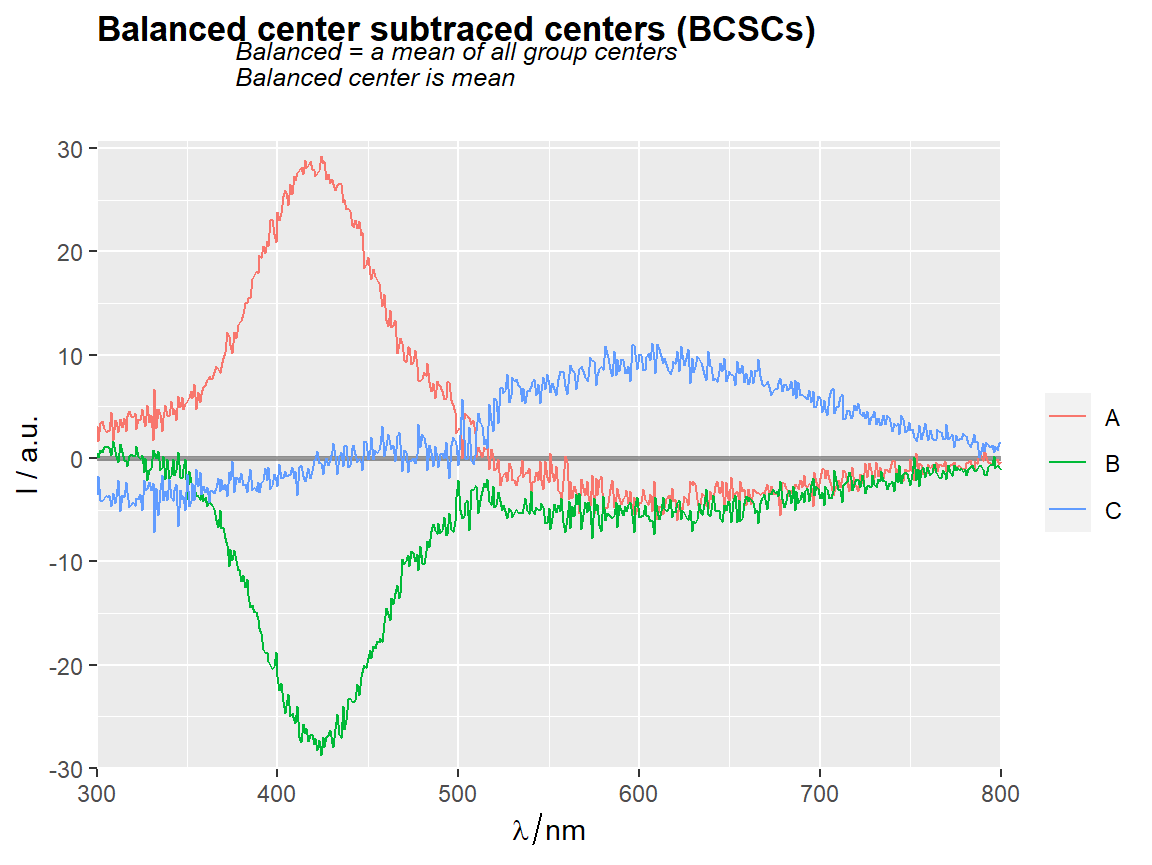
center_subtracted_centers(Spectra2, "gr",
                          balanced = TRUE,
                          balance.FUN = median)  %>%
    qplot_sp(names.in = "gr") +
    ggtitle(subt("Balanced center subtraced centers (BCSCs)",
                 "Balanced center is median"))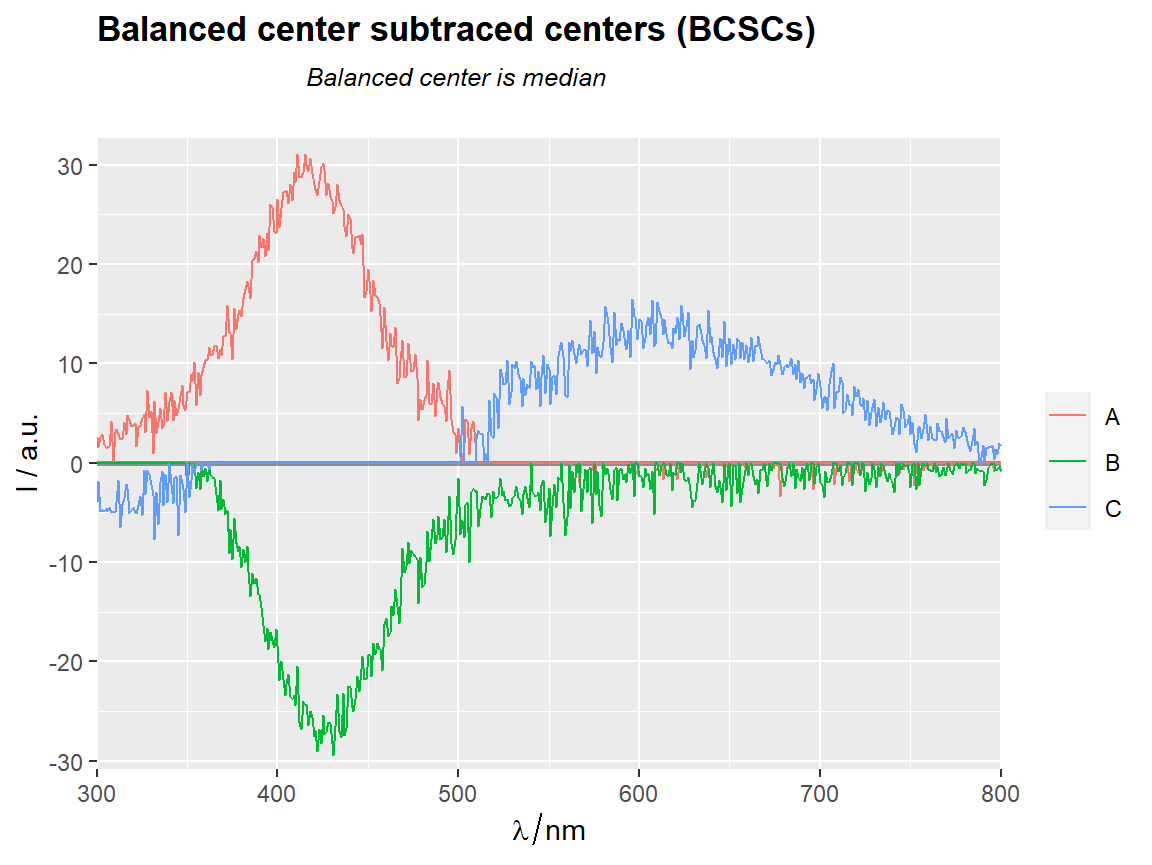
# === Scaled data ==========================================================


MED <- apply(Spectra2,2,median)
MAD <- apply(Spectra2,2,mad)   # median absolute deviation
scale(Spectra2,center = MED, scale = MAD)  %>%
    center_subtracted_centers(by = "gr")  %>%
    qplot_sp(names.in = "gr") +
    ggtitle(subt("CSCs of scaled data","Scaling: x = (x-median)/MAD"))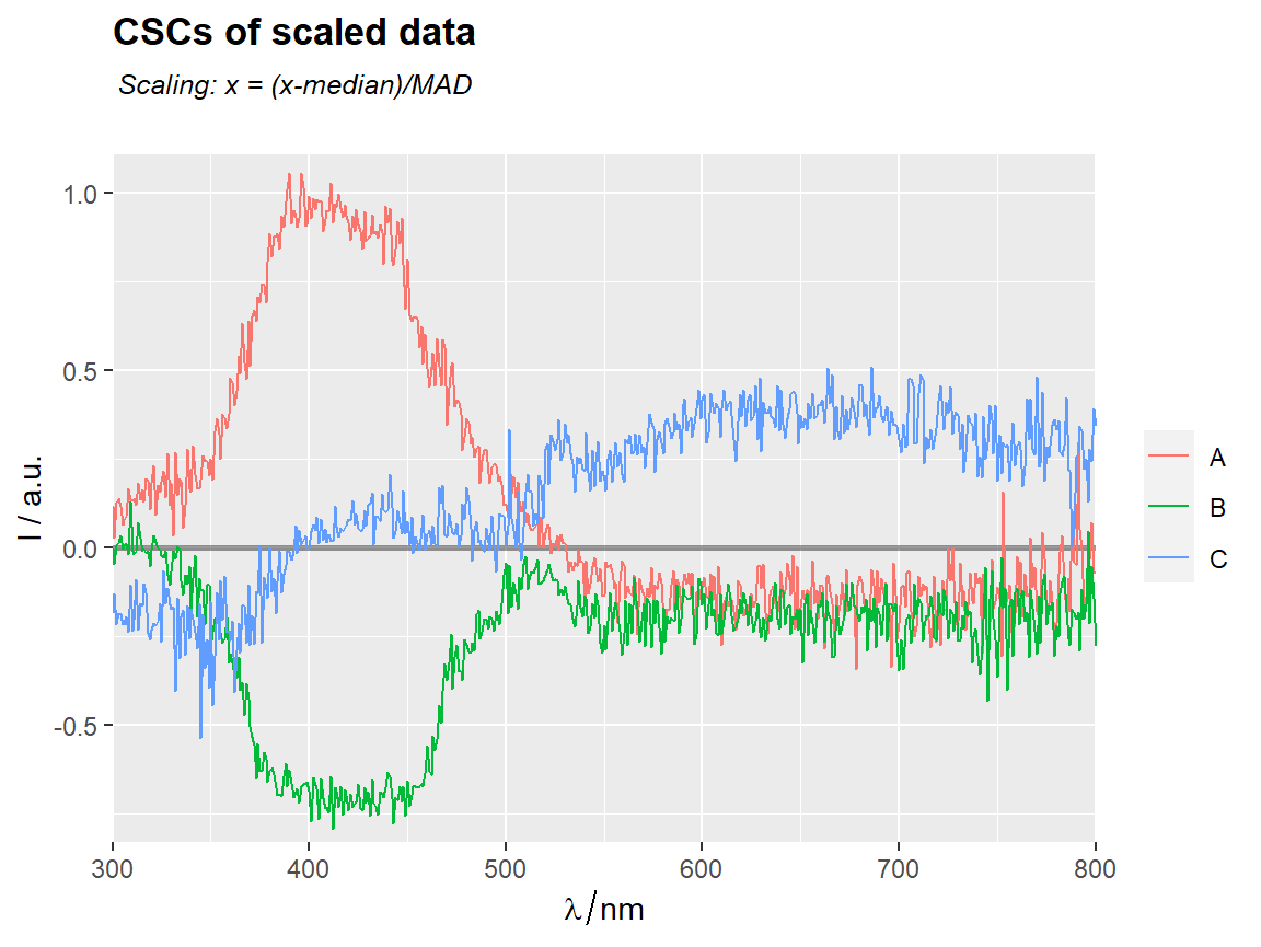
scale(Spectra2,center = MED, scale = MAD)  %>%
    center_subtracted_centers(by = "gr",
                              balanced = TRUE,
                              balance.FUN = median)  %>%
    qplot_sp(names.in = "gr") +
    ggtitle(subt("Balanced median SCs of scaled data",
                 "Scaling: x = (x-median)/MAD"))
# === Add curves of common & balanced central tendencies =================

center_subtracted_centers(Spectra2, "gr",
                          show.balanced = TRUE,
                          show.all = TRUE)  %>%
    qplot_sp(names.in = "gr") +
    ggtitle(subt("Curves of common & balanced centers added",
                 "Imbalanced center subtracted centers"))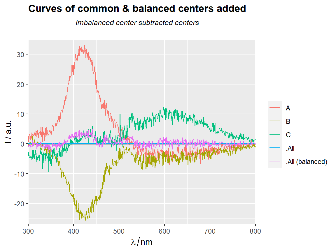
center_subtracted_centers(Spectra2, "gr",
                          balanced = TRUE,
                          show.balanced = TRUE,
                          show.all = TRUE)  %>%
    qplot_sp(names.in = "gr")+
    ggtitle(subt("Curves of common & balanced centers added",
                 "Balanced center subtracted centers"))
center_subtracted_centers(Spectra2, "gr", Center = "C",
                          show.balanced = TRUE,
                          show.all = TRUE)  %>%
    qplot_sp(names.in = "gr")+
    ggtitle(subt("Curves of common & balanced centers added",
                 "Group 'C' center subtracted centers"))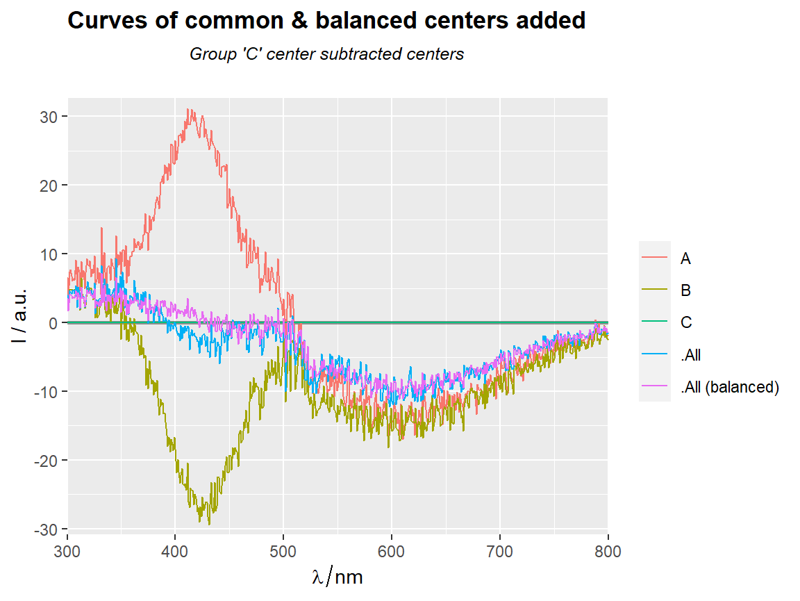
qplot_proximity and qplot_prediction
Examples with a hyperSpec object
 clear()

 data(Scores2)
 Scores2$Prediction <- sample(Scores2$gr)
 Scores2 <- hyAdd_color(sp = Scores2, by = "gr", palette = c("tan3", "green4","skyblue"))

 qplot_prediction(Scores2,Prediction = "Prediction", Reference = "gr")
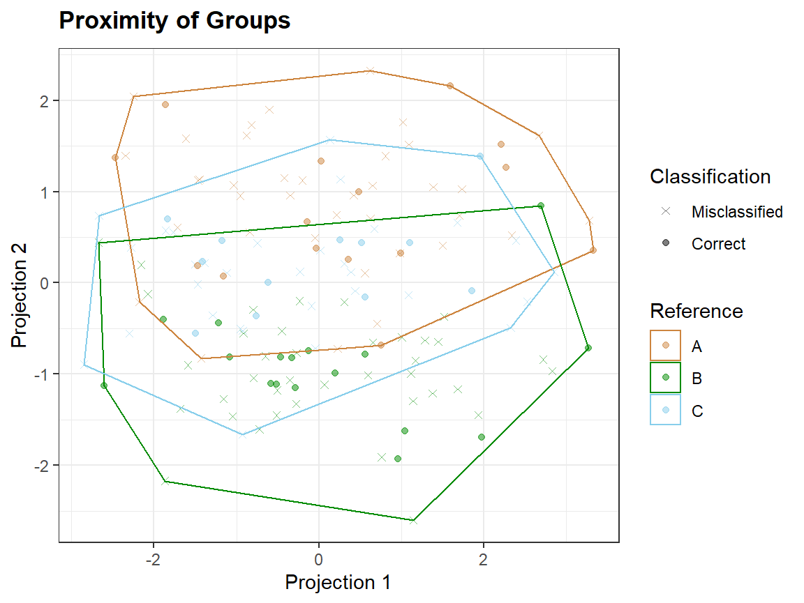
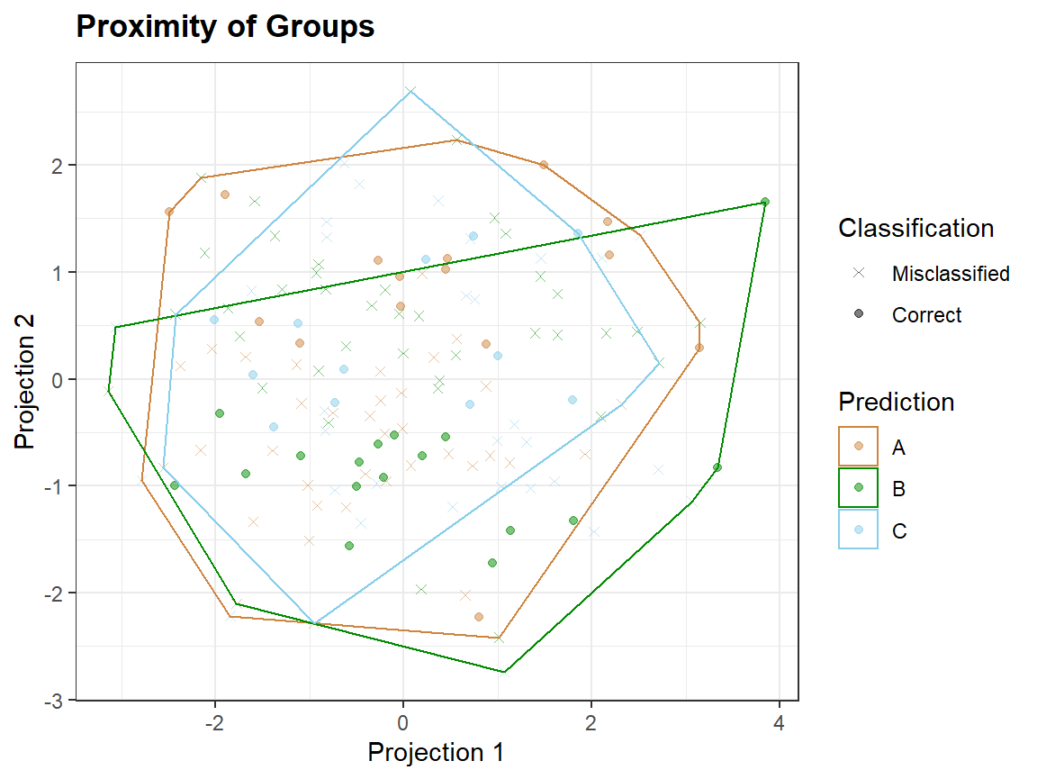
Taking a smaller number of variables, which are not noise, may lead to better discrimination of groups.

In proximity plots qplot_proximity only one grouping variable is needed:
set.seed(1)
sc <- sample(Scores2[,,c(1,2),wl.index = TRUE],50)
sc <- hyAdd_color(sp = sc , by = "class", palette = c("tan3", "green4","skyblue","violet"))
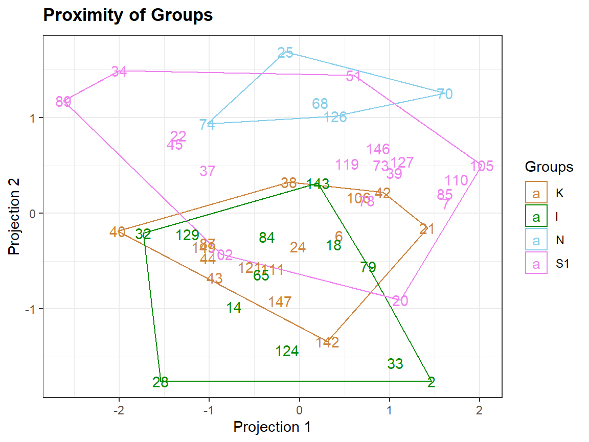
ID <- rownames(sc)
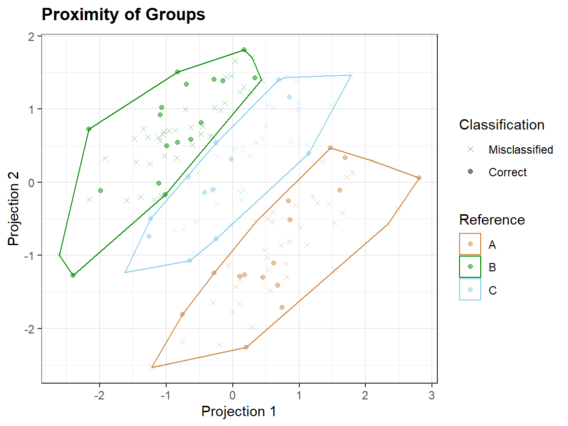
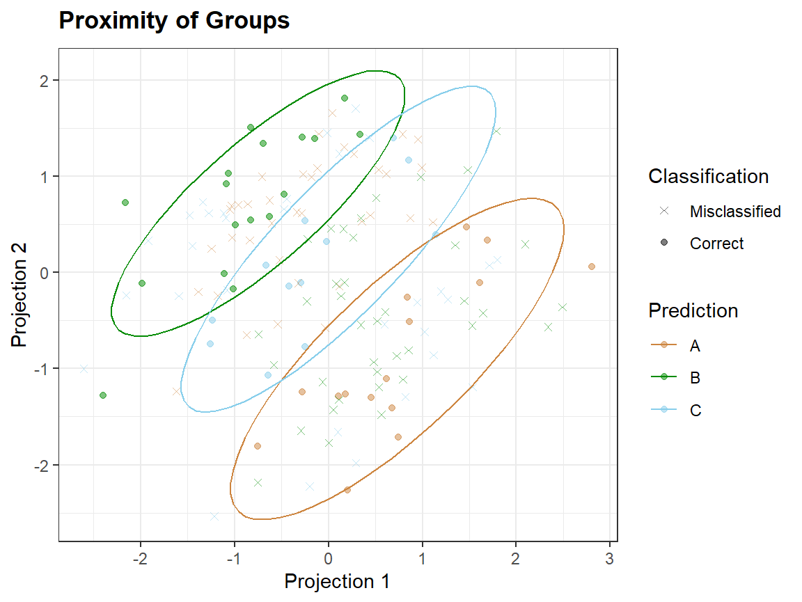
qplot_proximity(sc, "class")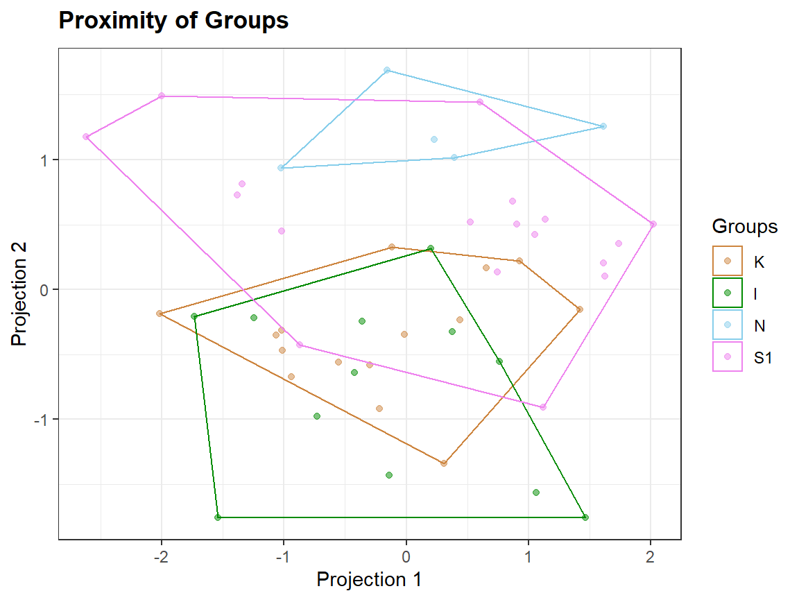
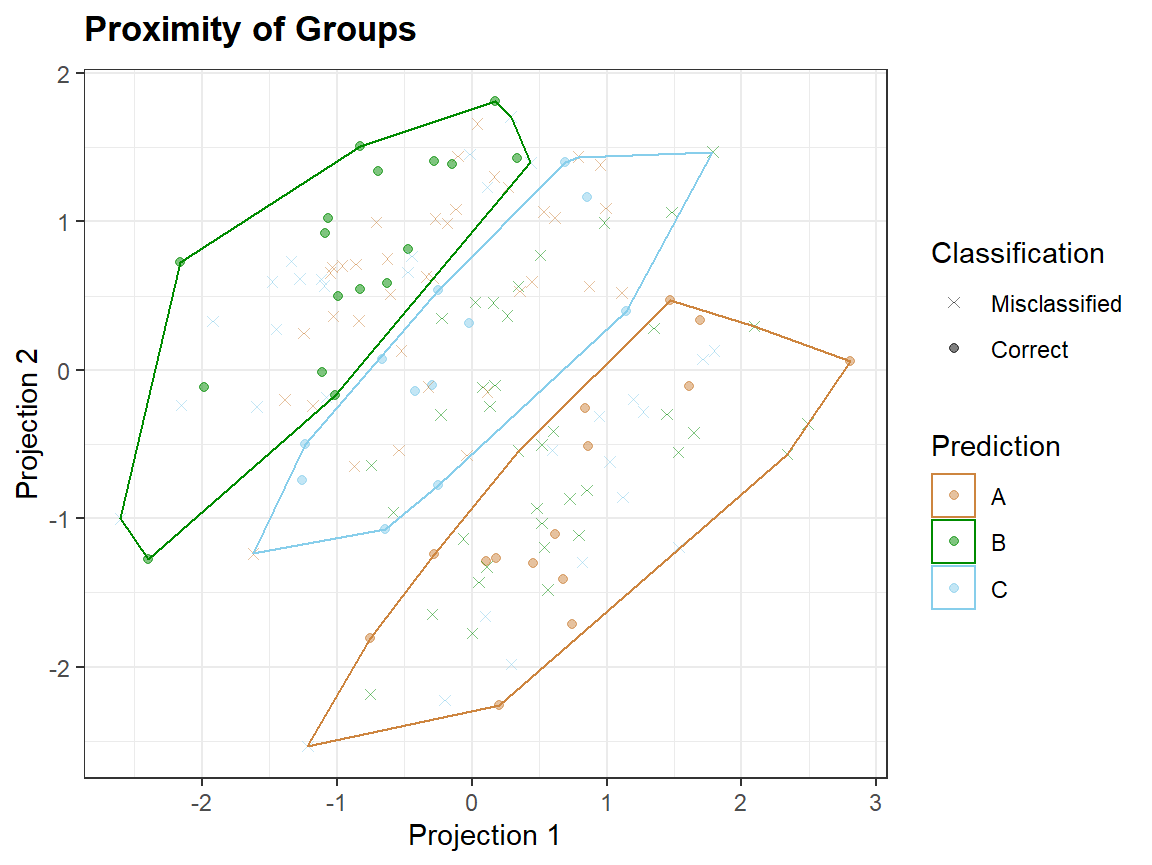
Plotting extra information
 Clusters <- as.factor(kmeans(sc,3)$cluster)
 qplot_proximity(sc, "class", stat = FALSE) + stat_chull(aes(fill = Clusters), color = NA, alpha = .2)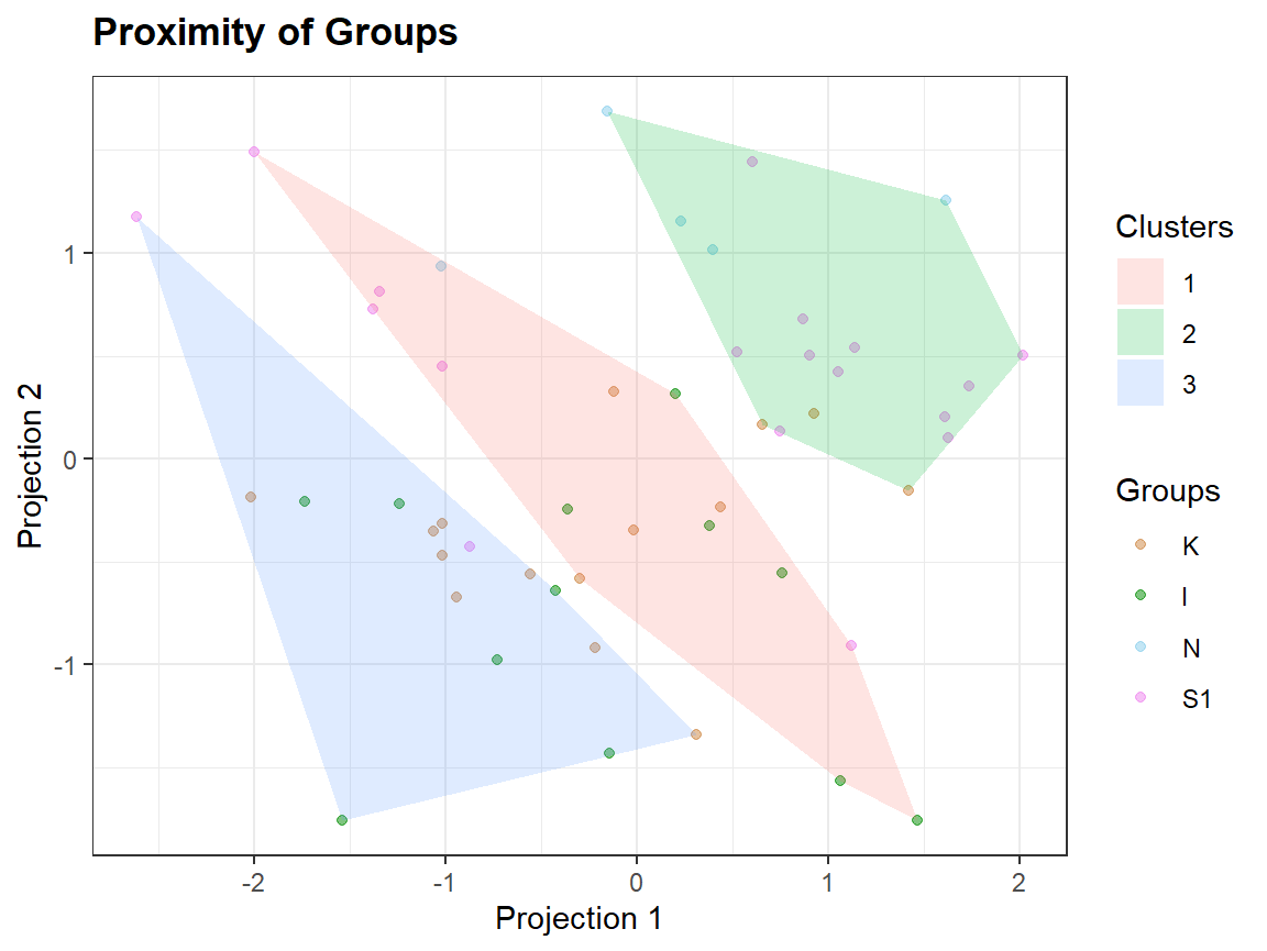
qplot_crosstab
# Generate data: Random guess ============================
N <- 1000 # number of observations
Prediction <- sample(c("A","B","C","D"), N, replace = TRUE)
Reference <- sample(c("A", "B","C","D","E"),N, replace = TRUE)
tabl <- table(Prediction,Reference)
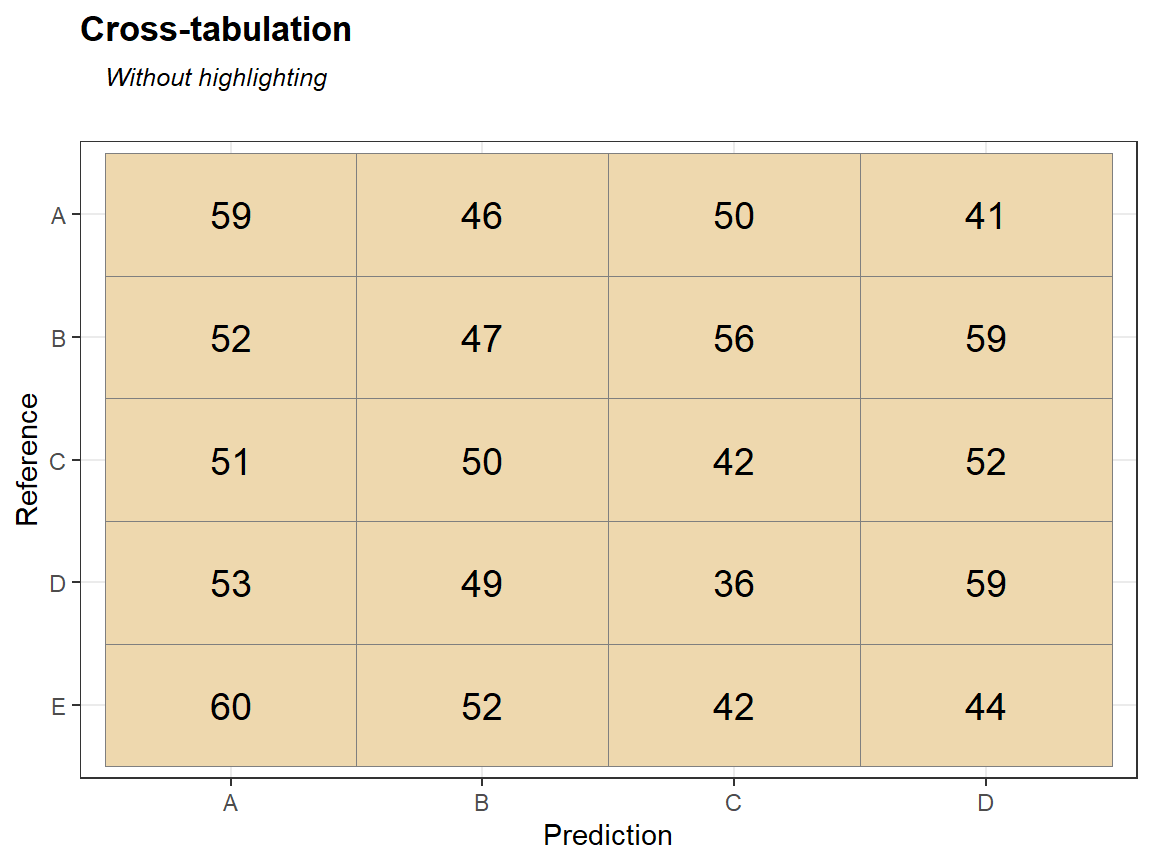
qplot_crosstab(tabl)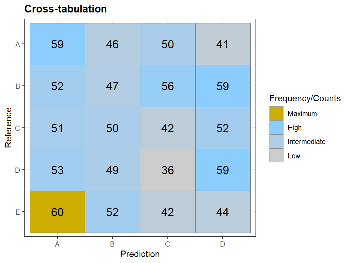
qplot_crosstab_sort(tabl,subTitle = "Columns and rows sorted by the best match") # different order of columns and rows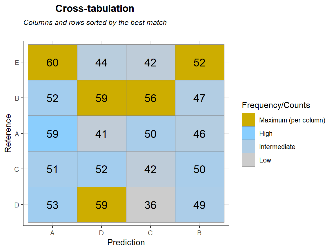
qplot_crosstab0s(tabl,subTitle = "Sorted by the best match, no highlighting") # no colors, different order of columns and rows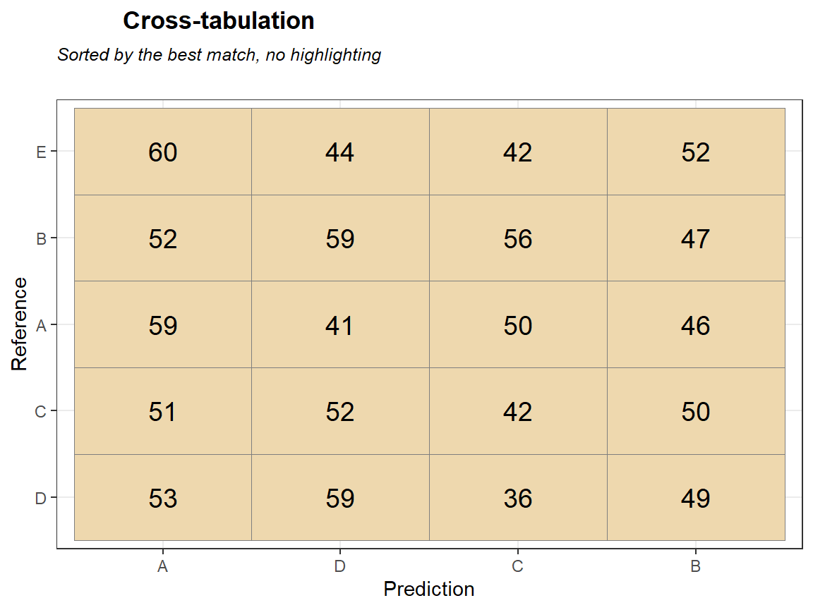
qplot_confusion
d <- 5 # number of rows/columns
Mat <- matrix(sample(0:100,d ^ 2,T),d)
colnames(Mat) <- paste0("gr",1:d)
rownames(Mat) <- colnames(Mat)
class(Mat)
#> [1] "matrix"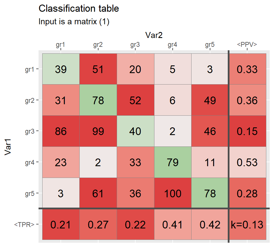
diag(Mat)[2:3] <- c(1000,250)
qplot_confusion(Mat, subTitle = "Input is a matrix (2)", TPR.name = "<Sensitivity>")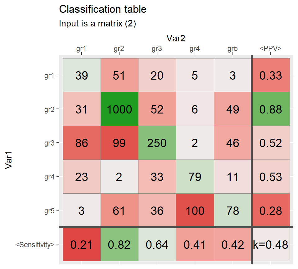

set.seed(165)

N <- 1000 # number of observations

Prediction <- sample(c("A","B","C","D"),N, replace = TRUE)
Reference  <- sample(c("A", "B","C","D"),N, replace = TRUE)


qplot_confusion(Prediction, Reference, subTitle = "Correct by chance (inputs are two vectors)")
#> [1] "table"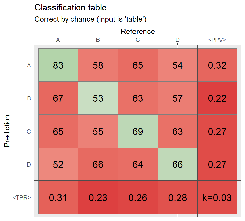
# At least 40% of the cases agree =====================
ind2 <- sample(1:N,round(N*.50))
Reference[ind2] <- Prediction[ind2]
conf2 <- table(Prediction,Reference)

qplot_confusion(conf2, subTitle = "Correct >50%")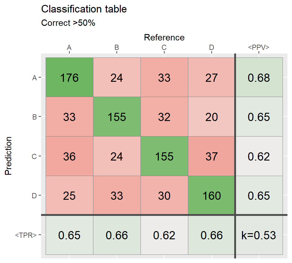
# Most of the cases agree =============================
ind3 <- sample(1:N,round(N*.80))
Reference[ind3] <- Prediction[ind3]
conf3 <- table(Prediction,Reference)

qplot_confusion(conf3, subTitle = "Correct >80%")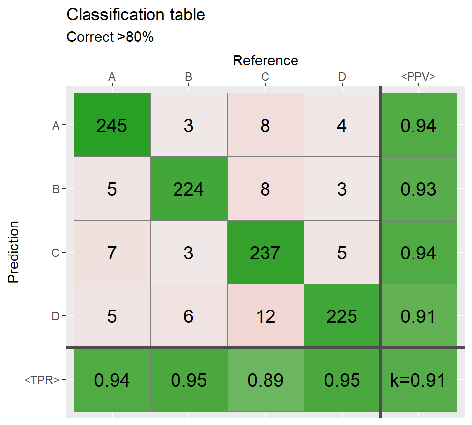


# Sort rows and columns by the best match ============
conf3_sorted <- sort_descOnDiag(conf2)
qplot_confusion(conf3_sorted, subTitle = "Columns and rows sorted by the best match")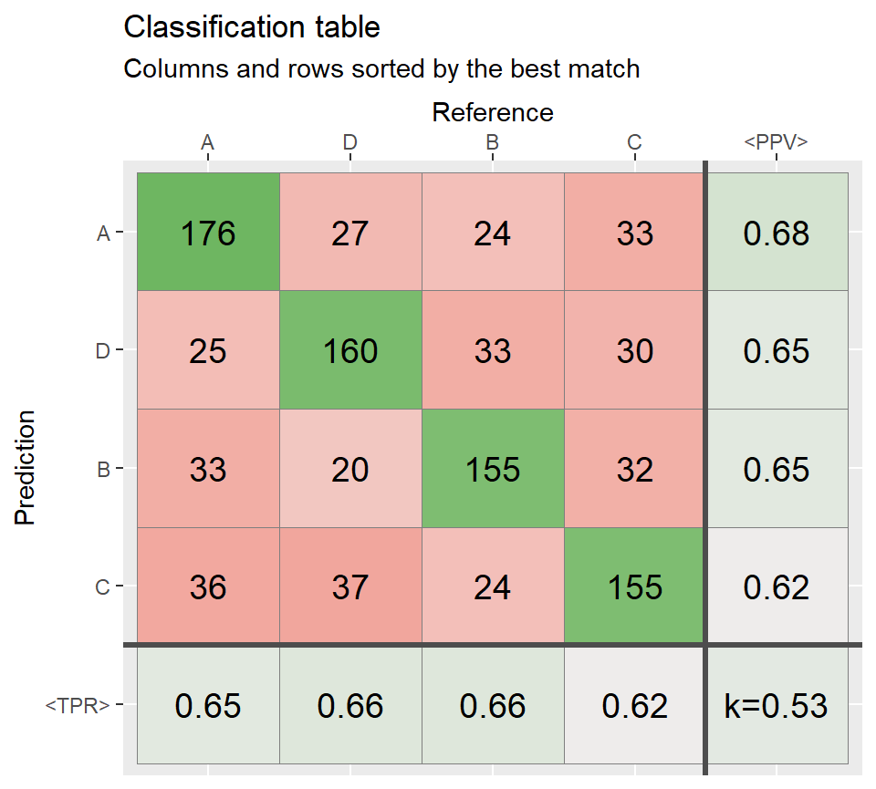
# Proportions =========================================
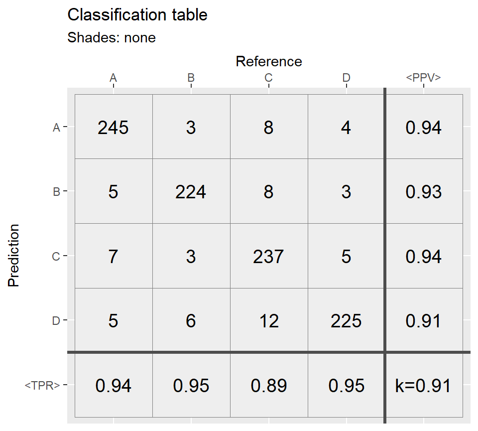
qplot_confusion(conf3 , subTitle = "Counts")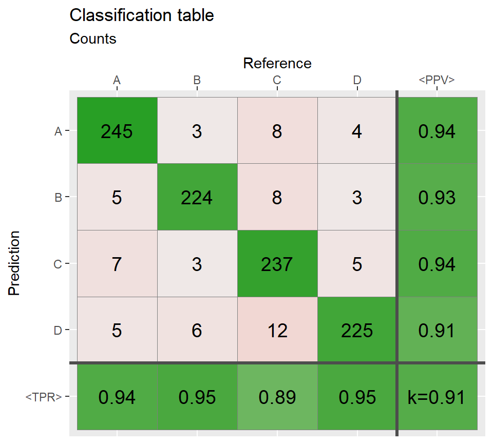
#> Warning in cohen.kappa1(x, w = w, n.obs = n.obs, alpha = alpha, levels =
#> levels): upper or lower confidence interval exceed abs(1) and set to +/- 1.
# Shades: proportional ================================
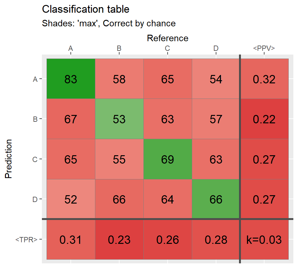
qplot_confusion(conf,shades = "prop", subTitle = "Shades: 'prop', Correct by chance");


# Shades: constant and none ===========================

qplot_confusion(conf3,shades = "const",subTitle = "Shades: constant");
n <- round(N/6)
Prediction[sample(which(Prediction == "A"),n,replace = TRUE)] <-
    sample(c("B","C"), n,replace = TRUE)

conf4 <- table(Prediction,Reference)

qplot_confusion(conf4, subTitle = "Imbalanced class proportions")
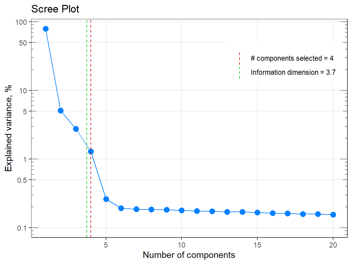
infoDim, qplot_infoDim and qplot_screeplot
# Example 1 =============================================================
my_matrix <- matrix(rexp(2000, rate = .1), ncol = 20)
my_result <- infoDim(my_matrix)

# Investigate the result
str(my_result)
#> List of 5
#> $ dim : num 17
#> $ exactDim : num 16.9
#> $ explained : num [1:20] 0.1985 0.0656 0.0561 0.0548 0.0533 ...
#> $ eigenvalues: num [1:20] 461 152 130 127 124 ...
#> $ n.comp : int [1:20] 1 2 3 4 5 6 7 8 9 10 ...
#> - attr(*, "class")= chr [1:2] "list" "infoDim"#> [1] 16.9385#> [1] 17
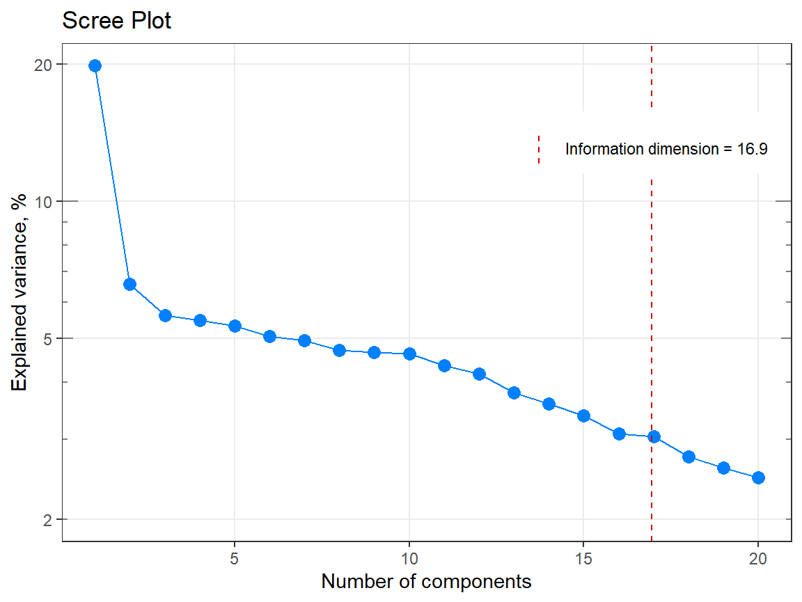

# Example 2 =============================================================

p1 <- qplot_infoDim(Spectra2) # Object of class "hyperSpec"
p1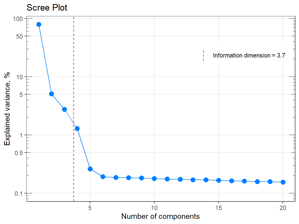

unipeak - Transform Spectra of Components
#  Example 1 -------------------------------------------------------

x     <- seq(-10,20,.1)
y0    <- GaussAmp(x, c = 0, A = 1) + GaussAmp(x, c = 10, A = 2) - .5
y0NEW <- unipeak(y0)

# Plot the results
par(mfrow = c(1,1))
plot( x, y0,    type = "l", lty = 3,
      main = "'unipeak' keeps positive part \n of highest peak only" );
lines(x, y0NEW, type = "l", lty = 1, lwd = 3);
legend("topleft", legend = c("Before","After"), lty = c(3,1))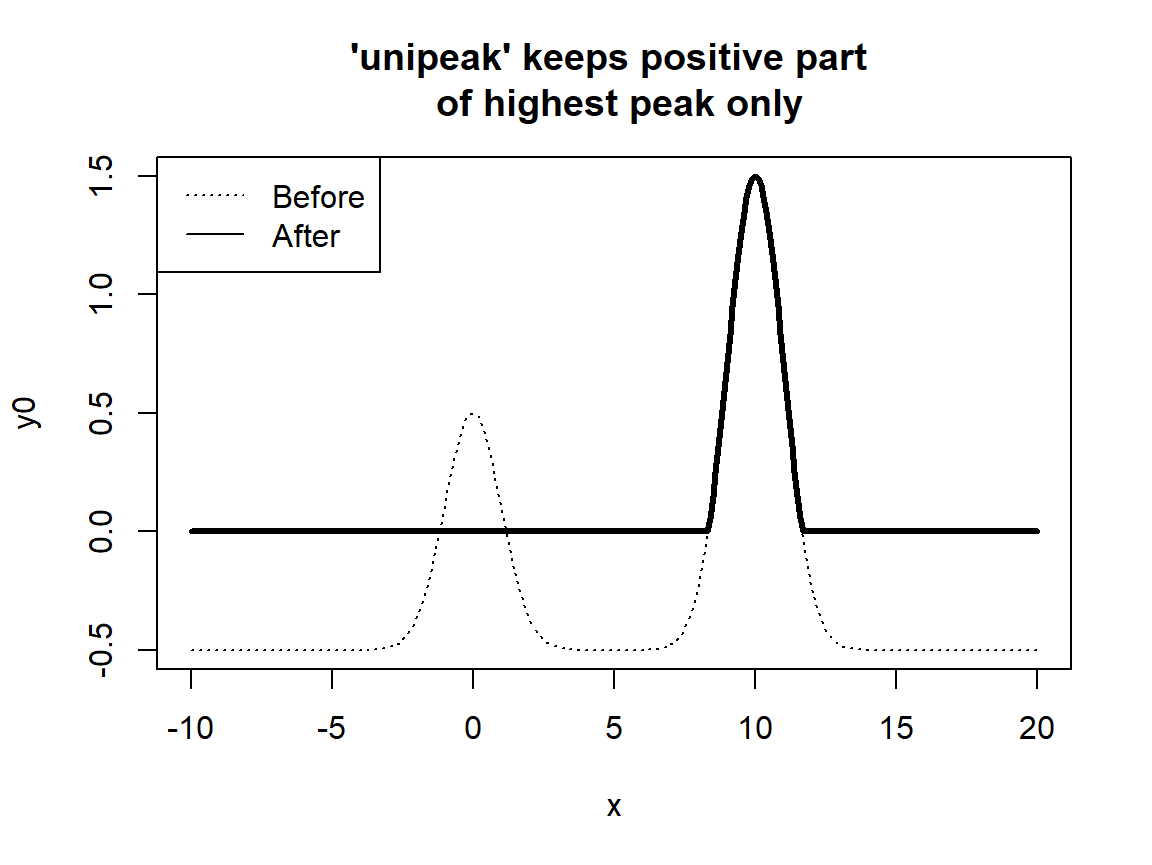
#  Example 2 -------------------------------------------------------

x  = seq(-10,20,.1)
y1 = (sin(x/4) + GaussAmp(x))
y2 = (2*sin(x) + sin(x/5) + GaussAmp(x, c = 5))
y  = base::rbind(y1,y2)

yNEW <- apply(y,1,unipeak)

par(mfrow = c(3,1))

# plot 1
matplot(x, t(y), type = "l", lty = 3,
        main = "A - Initial curves");
abline(h = 0)

# plot 2
matplot(x,yNEW, type = "l", lty = 1,lwd = 3,
        main = "B - Only the highest positive\n peaks per curve");
abline(h = 0)

# plot 3: both plots together
matplot(x, t(y), type = "l", lty = 3, main = "A and B together");
matlines(x,yNEW, type = "l", lty = 1,lwd = 3);
abline(h = 0)
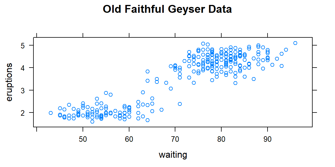
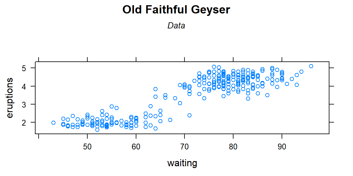
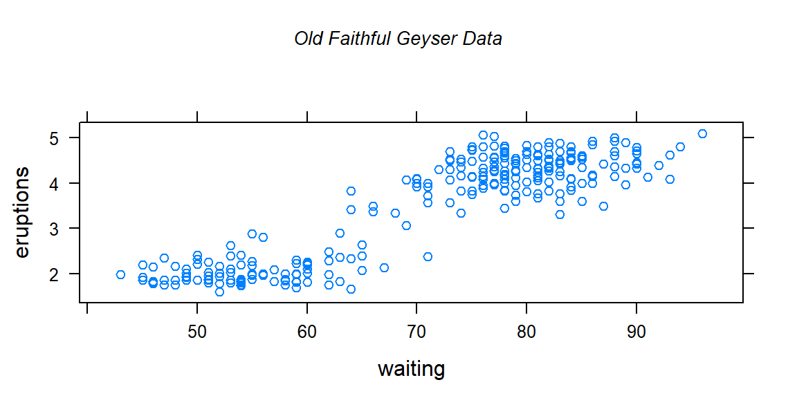
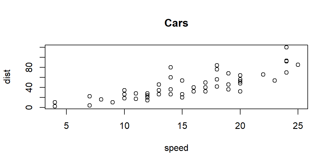
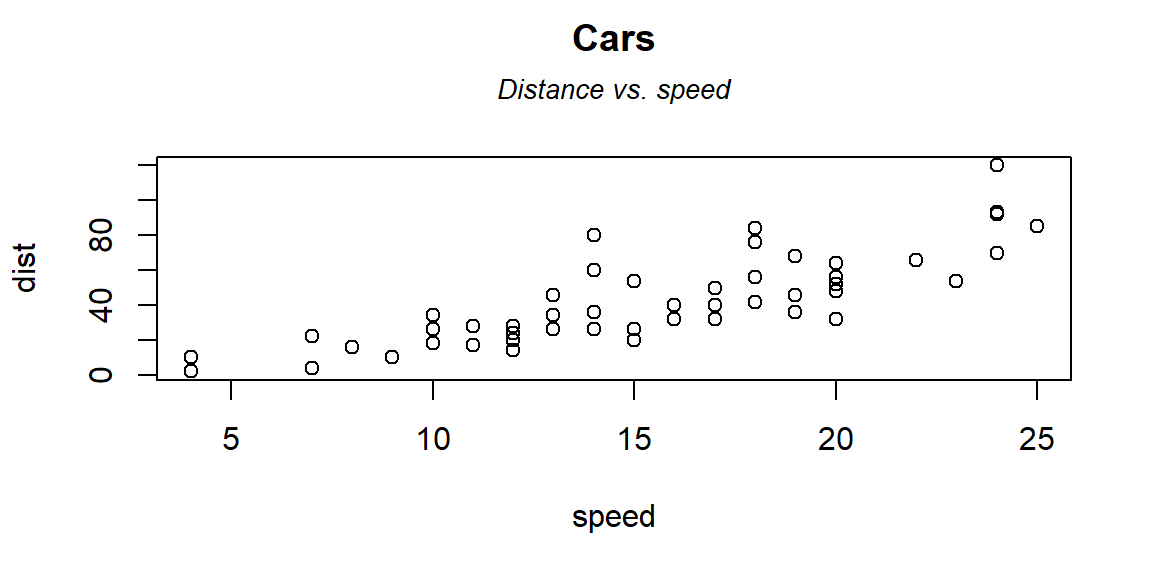
subt - Title and Subtitle
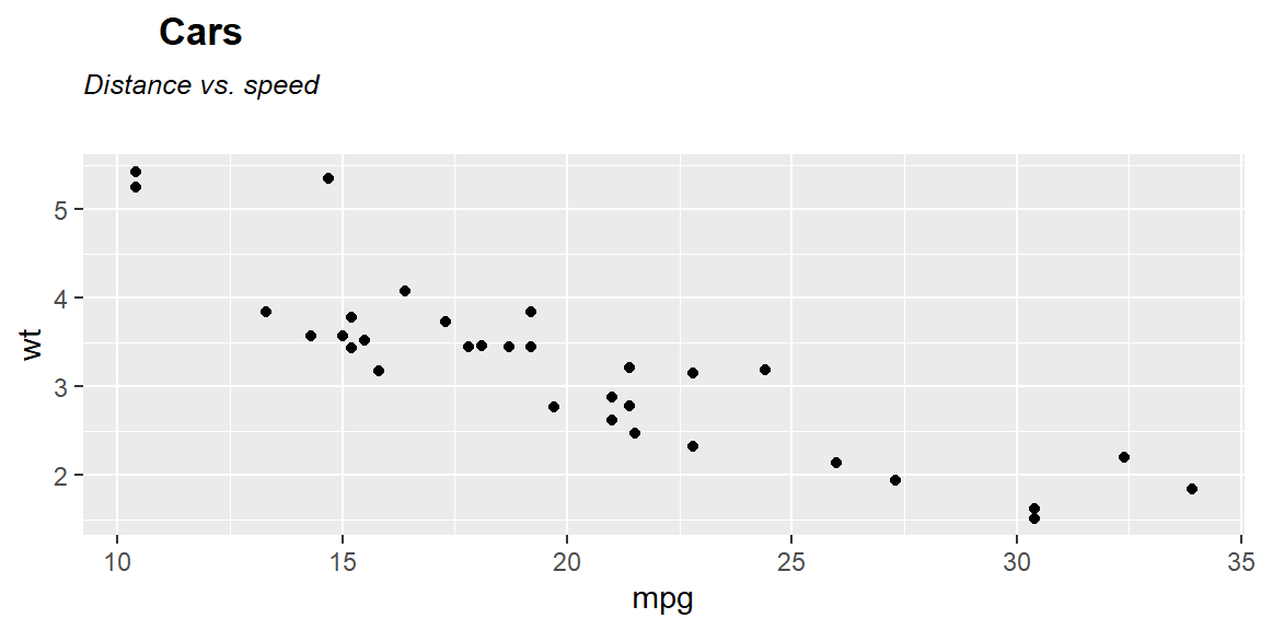
#> bold("Cars")#> atop(bold("Cars"), atop(italic("Distance vs. speed"))) ## atop(bold("Cars"), atop(italic("Distance vs. speed")))
# ----------------------------------------------------------------
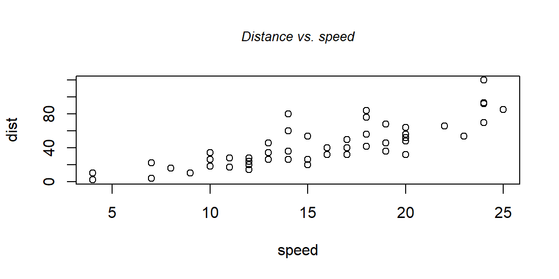
plot(cars[,1:2], main = "Cars")
# ----------------------------------------------------------------
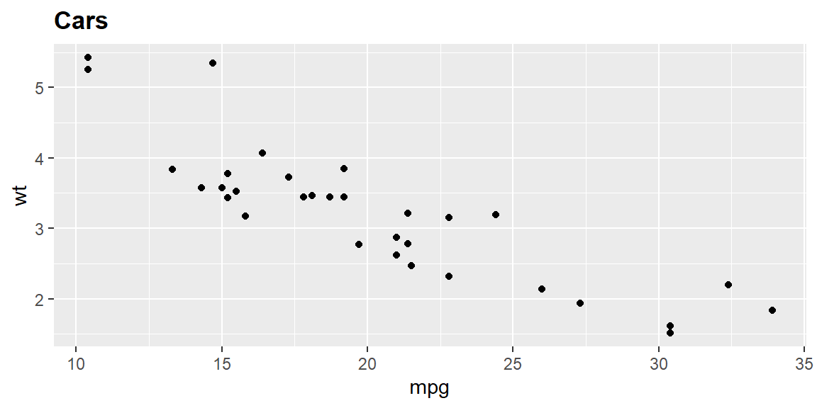
library(ggplot2)
g <- qplot(mpg, wt, data = mtcars)
g + ggtitle("Cars") # non-bold title

# ----------------------------------------------------------------
library(lattice)
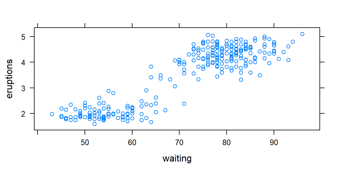
xyplot(eruptions~waiting, data = faithful)